¿QUÉ PODEMOS ESPERAR DE LOS COLORES DEL AÑO DE FARROW & BALL? ARMONÍA
Según Joa Studholme, comisaria de color de la marca, los humanos buscamos autenticidad, sostenibilidad y, lo que es más importante, comodidad en nuestros interiores. A medida que nuestro mundo sigue cambiando, anhelamos un espacio fiable en el que podamos refugiarnos para recibir un poco de cariño.
Teniendo esto en cuenta, ¿qué indican las predicciones de tendencias de color de Farrow & Ball para 2024? Te contamos todo lo que necesitas saber: coge un rodillo de pintura.
Joa Studholme lleva más de 25 años trabajando con Farrow & Ball y se ha convertido en una pieza clave de la historia de la marca: ayudó a lanzar el primer Showroom, se convirtió en la primera consultora de color y ha creado muchos de los colores.
Además de todo esto, el papel actual de Joa se centra en mostrar a la gente el poder de la pintura para transformar un espacio, algo que comprendió desde muy joven. Aunque elegir su color Farrow & Ball favorito es algo que Joa compara con elegir a su hijo favorito, es una firme admiradora de Bamboozle por su espíritu ardiente y la forma en que hace brillar las habitaciones.
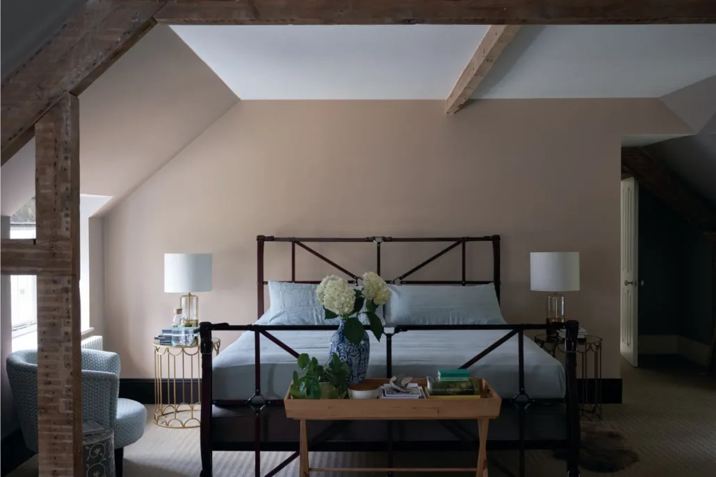
Los tonos elegidos por Farrow & Ball evocan serenidad. Aunque no hay un tono en concreto, la marca predice que los tonos arcilla van a aumentar su popularidad en 2024. Los tonos arcilla pueden engañar al ojo y hacer que parezca que tu habitación es más grande de lo que es.
Puede que parezca que el color del año es un poco tranquilo, pero ten por seguro que se puede añadir un toque chic y elegante combinándolo con muebles y decoración divertidos. «Neutro» y «arcilla» no indican una paleta de colores aburrida.
¿Cuáles son las opciones para elegir? Jitney, Oxford Stone, Tanner’s Brown y Stirabout se van a convertir especialmente en productos de moda.
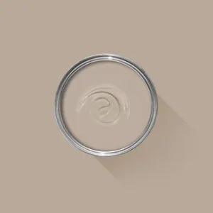
Jitney No. 293
Un neutro terroso y relajado de base marrón que se sitúa entre Stirabout y London Stone.
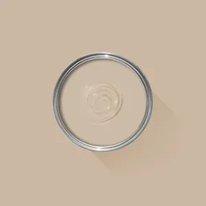
Oxford Stone Nº 264
El clásico topo oscuro de la marca está inspirado en los pueblos de Oxfordshire.
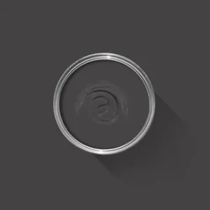
Tanner’s Brown Nº 255
El tono arcilla más oscuro de Farrow & Ball, que recibe su nombre de los artesanos que curten los cueros y pieles utilizados para crear cuero.
Stirabout No. 300
Un tono terroso con un pequeño toque de gris, Stirabout se inspira en las gachas de avena que se sirven en Irlanda.
Según Studholme, hay varias formas de mantener estos tonos frescos y vivos. «Utilizar tonos más claros en las paredes y tonos más oscuros en las molduras se convertirá en la norma para crear espacios más amplios y luminosos, dando a las habitaciones un aspecto más alegre«, afirma.
Además, ella y el resto del equipo de Farrow & Ball sugieren mezclar acabados (mate y brillante, por ejemplo) para añadir diferentes texturas. Incluso la posibilidad de considerar el papel pintado para complementar el look. Los representantes de la marca insisten en usar distintos colores de papel pintado con la misma forma para que la habitación destaque.
Si quieres tener más información sobre las pinturas Farrow & Ball y estos colores en especial, puedes encontrar más información en nuestra web o acercándote a cualquiera de nuestras tiendas en Madrid.